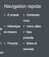
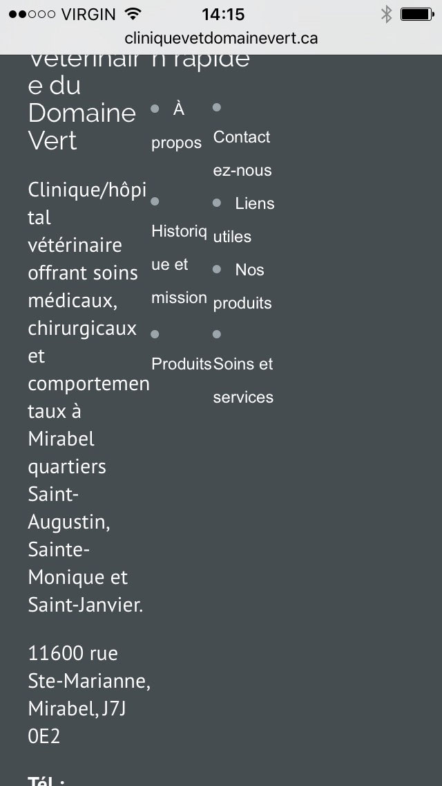
Useful links in footer Home › Forums › Kraft Theme Support › Useful links in footer This topic has 2 replies, 2 voices, and was last updated 8 years, 1 month ago by Sonnal S Sinha. Viewing 3 posts - 1 through 3 (of 3 total) Author Posts March 8, 2016 at 6:31 pm #26033 March 8, 2016 at 7:28 pm #26036 Patrick LewisMember Topics: 12Replies: 16Total: 28 Member since: October 29, 2015 And with the two sections on a mobile device, i have this March 9, 2016 at 10:27 am #26132 Sonnal S SinhaModerator Topics: 0Replies: 30633Total: 30633 Member since: August 16, 2013 Hi Patrick, Kindly go to Appereance>>Theme Option>>Basic Setting>>Custom CSS Box Add this code: @media screen and (max-width:1169px) and (min-width:768px) { .cols-3 {width: 32% !important;} } Regards, Dave Author Posts Viewing 3 posts - 1 through 3 (of 3 total) You must be logged in to reply to this topic. Log In Username: Password: Keep me signed in Log In
 .
.
 .
.